How climate change is threatening our coasts
As global temperatures continue to warm, on #ShowYourStripes day we asked climate scientists at the National Centre for Atmospheric Science to explain why our coastlines are at risk from climate change.
Global warming and sea level rise
Rising sea levels are one of the most severe effects of climate change, threatening coastal areas around the world, and putting millions of people who live in low-lying areas at risk. Bangladesh, Florida, and eastern England are among the many areas known to be particularly vulnerable.
“In the years since the IPCC’s Fifth Assessment Report in 2013 and the Special Report on the Ocean and Cryosphere in a Changing Climate in 2019, the evidence tying the melting of glaciers and the Greenland Ice Sheet, as well as ocean warming, to human-caused climate change and global warming has become even clearer,” shares Robin Smith, Associate Professor at the National Centre for Atmospheric Science and the University of Reading.
Under scenarios in which global warming goes beyond 2°C, the Paris Agreement target, we should expect significant ice loss and several metres of global sea level rise to persist for tens of thousands of years.
“The warmer the climate, the faster the ice will be lost and the faster we’ll have to adapt to higher sea levels,” says Professor Smith.
Sea level rise is having substantial impacts on coastal communities, and there has been an increase in the frequency of coastal flooding over the past 60 years in many sites around the world.
Even if temperatures later return to current levels due to action on slowing down or reversing climate change, scientists have shown that the Greenland Ice Sheet might never fully regrow once it melts beyond a critical point. After that point, sea levels would permanently remain at least two metres higher than now, regardless of other factors contributing to sea level rise.
Over the last decade, global average sea level has risen at a rate of about 4 millimetres per year. This increase is due to the melting of ice in mountain glaciers and at the poles, and the expansion of water in the ocean as it takes up heat.
Over 70% of Earth’s surface area is ocean. The ocean plays a major role in regulating Earth’s climate system, and sea surface temperatures have a particularly large influence on climate and weather.
Warmer sea temperatures mean there is more water in the atmosphere so when it rains, it rains more, increasing the risk of flooding. When storms hit our coastlines the risk of coastal flooding is increased because sea levels are higher.
Show Your Stripes
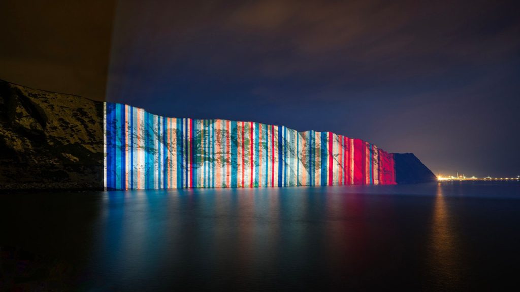
Projected onto the White Cliffs of Dover this week, a simple but striking climate change visualisation – known as the Warming Stripes – aims to capture people’s attention and spark conversations on climate change and sea level rise.
#ShowYourStripes is a global climate change movement, every year on 21 June, which encourages people to share the Warming Stripes infographic.
Created by Professor Ed Hawkins at the National Centre for Atmospheric Science and University of Reading, the Warming Stripes is a visual timeline of our changing climate.
Professor Ed Hawkins, a climate researcher who created the colourful graphic says:
“The warming stripes show the stark reality of how quickly the planet has heated over the past few decades, combining billions of scientific measurements into one striking image. The stripes do not show our future, which is still entirely in our hands – the faster we act the smaller the climate consequences will be.
“The aim of the climate stripes is to start conversations and bring climate science to more people. I hope they help bring climate impacts, like sea level rise, and climate action to the front of people’s minds once again this year.”
To create the design, Professor Hawkins’ replaced numerical data with intuitive colours to help people to understand how the planet has warmed over the last one hundred and fifty years.
The climate stripes use bands of colour to show how temperatures in all corners of the world have risen dramatically in recent years. Shades of red are used to denote years that were hotter than the average for the period, and blues to indicate cooler years.
The climate timelines start from the earliest available records, typically during the nineteenth century, and continue to the present day. They reveal a dramatic rise in temperatures in recent decades.
How will you #ShowYourStripes? Join the global conversation on climate change action by using the hashtag #ShowYourStripes. Follow @AtmosScience, @Ed_Hawkins, and @UniofReading on Twitter.
